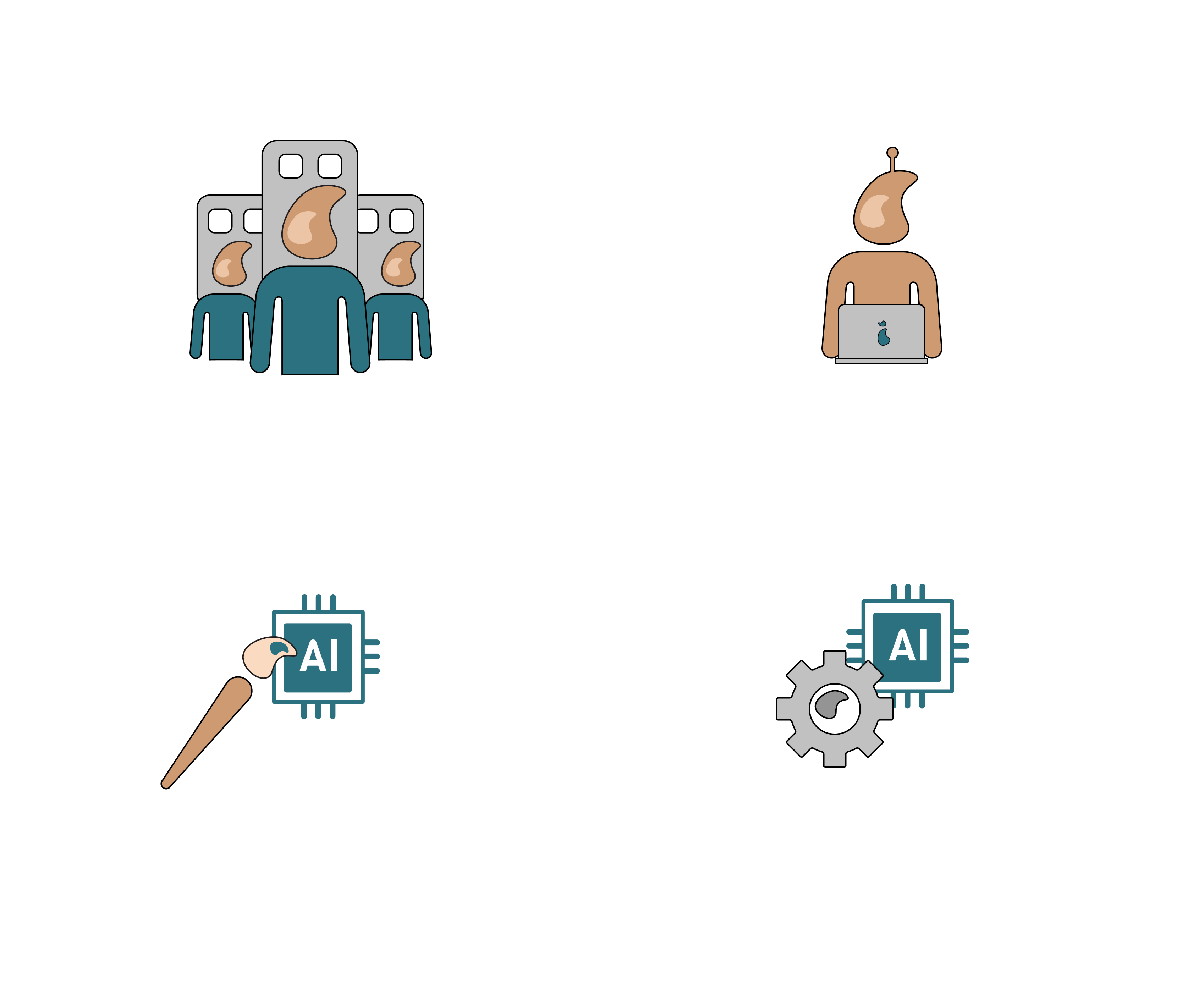
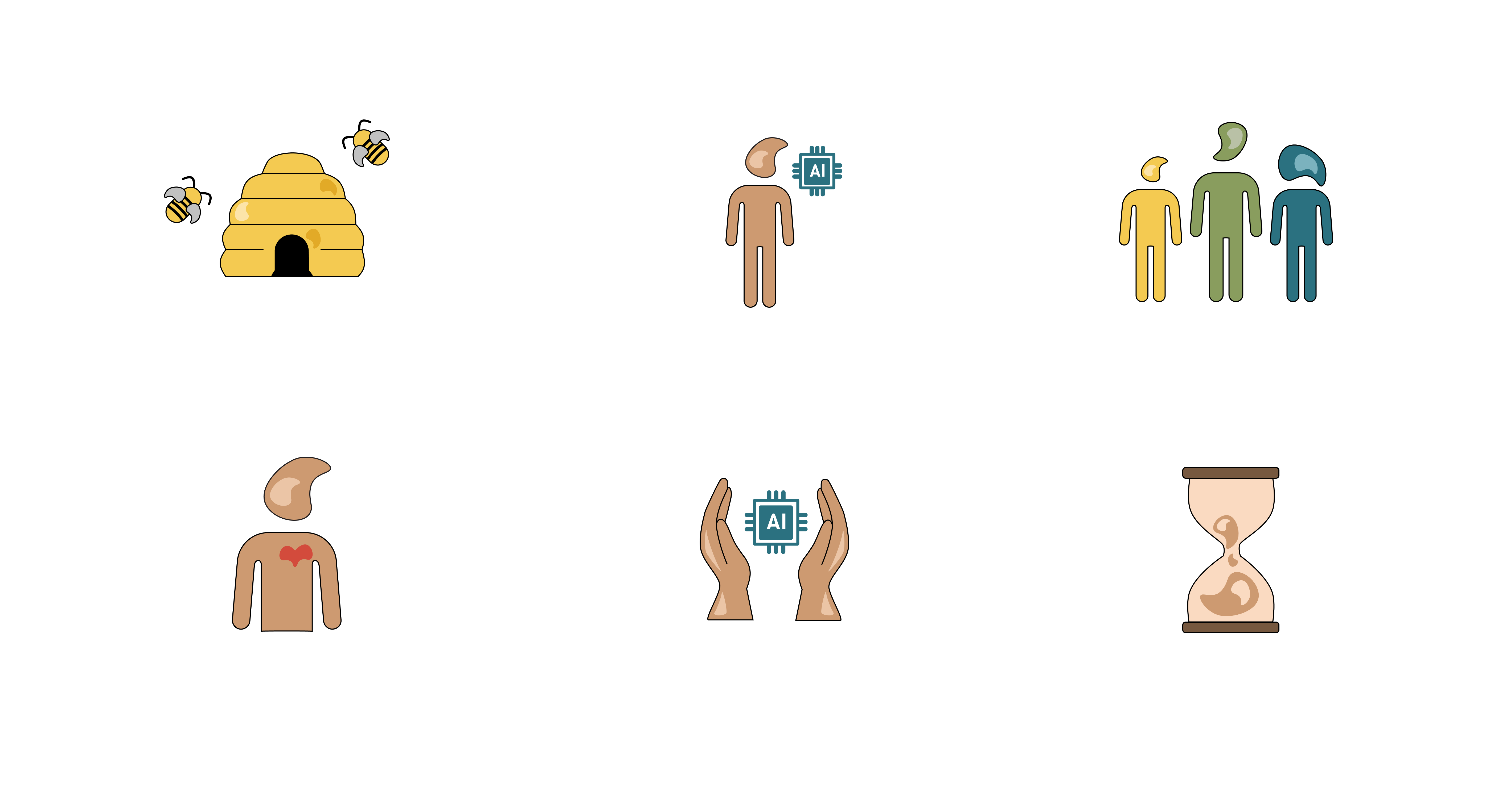
RAAIT is a company that designs, develops, and directly applies AI solutions in practice. For
their manifesto and toolbox, which highlight six core principles, they asked me to redesign
their outdated icons.
The results
I created a cohesive icon system that visually translates these principles while preserving
RAAIT's brand identity. To achieve this, I consistently integrated the bean figure,
a distinctive element present in both their logo and website,
into the icons. This establishes a clear visual link between the principles and RAAIT's
existing brand identity and ensures
stylistic consistency across their communication materials.
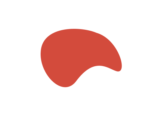
The RAAIT bean figure
Extra icons
RAAIT's toolbox is divided into different axes. One of the key explorations is identifying
which aspect of AI each tool belongs to. Within this framework, they have defined four
aspects, for which a new set of icons was required.
For these icons, I chose to maintain the brand identity while shifting further into the blue
tones of RAAIT's color palette. This creates a distinct yet harmonious extension of their
visual language.